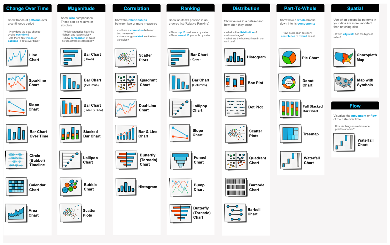
[Part III] The Complete List of Tableau Charts — with example Dashboard project

Tableau Charts Types
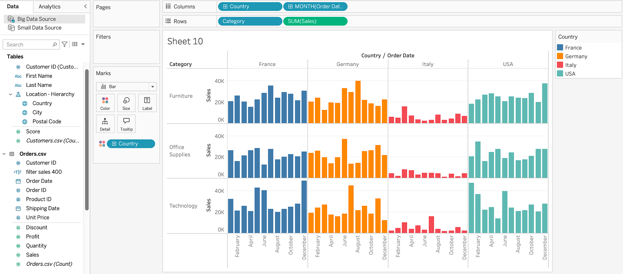
How do you add multiple measures in the same graph in Tableau?
You can use: Individual Axex, Single Axes, and Dual Axes.

A best practice in charts in Tableau is to:
- Add the Measure or Dimension with higher cardinality to the row
- Add the Measure or Dimension with low cardinality to the Columns
Examples of Charts
Multiple Small Bar charts 👇
Stacked Bar Charts 👇

Bar in Bar Charts 👇

Multi-line charts 👇

Multiple line charts👇

Dual Line Chart 👇

Bar & Line Charts (Dual Axis) 👇

Bullet Charts: To compare two measures 👇
- Current vs Previous Year / Actual vs Target

Stacked Area Chart 👇
Use cases: To analyze change over time / Part to Whole Relationship


Scatter Plot 👇
Use Cases: Correlation between two measures / Highlight outliers

Pie Chart 👇

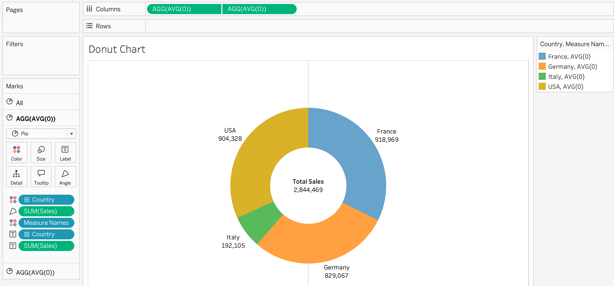
Donut chart 👇 (widely used more than the pie chart)
Its use cases: Part-to- Whole relationship & Big Number at the Centre.
Heatmap 👇 (correlation analysis)

Map 👇

Histogram with ONE Measure 👇

Histogram with TWO Measures 👇
Number of Customers by Number of Orders. We will use the Calculated Field LOD to create the Nr of Orders by Customer. Then we transform it to a Dimension and make it discrete.

KPI Chart 👇

Big Numbers KPI Chart 👇

How to choose the right Chart and which visualization to pick?
We learned so far 19 Type of the most common charts in Tableau but the question is: How to choose the right Chart and which visualization to pick?
- Understand the business question that needs to be answered
- Map the visual category
- Choose the right chart
How to design Dashboards

Step 1: Create a Mockup of the dashboard

Step 2: Create Containers Mockup
Make always boarders:
- Orange for vertical Containers
- Blue for Horizontal containers
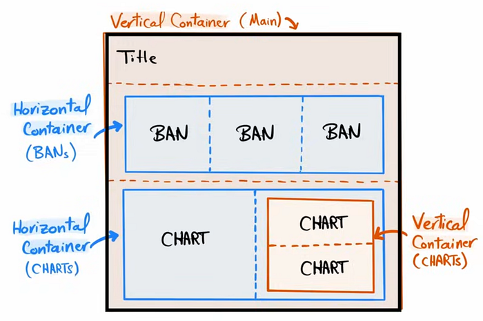
Tip: Always check the Item Hieararchy when building the containers

Step 3: Creating the Dashboard
Assuming you have created all the charts in the worksheets which you want to display in the Dashboard, the rest to do is just drag and drop in the corresponding container as planned in the dashboard mockup and and when dropping the charts make sure to remove the blanks.

You can find this dashboard at this link.
This was it for the article series of learning Tableau, I hope it was helpful!